Intermediate Tutorial: Finishing an Artwork

Hello guys, it has been a long time since my latest post “Tutorial: Color”. I have decided to make 3 different categories for tutorial from now on: Basic, Intermediate, and Advanced. 

Have you ever wondered “At what point is my artwork finished?” This tutorial will cover related questions such as :

  • When should I stop doing my artwork?
  • What makes the difference between my artwork and (insert godly artist here)‘s artwork?
  • I’ve studied the basics but why does my art still feel lacking?
  • Is there an end to this suffering rendering?

Yes, finishing an artwork is one of the greatest barrier that every artist SHOULD get through, in my opinion. It’s a very important thing to learn, but I rarely see people mention this.

“The Finish Line” basically explains when your artwork is finished, “Expanting the Finish Line” is about making it look even more finished, and we will conclude everything in “Conclusion”.

Disclaimer, this might be a very objective post as I am an illustrator who loves painterly things and I have traditional artist mindset in mind instead of digital artists. This might also be a post trying to describe what I think is a good illustration, but I’ll try my best to focus on the questions above.


The Finish Line

“When do you know your painting is done?” Marco Bucci explained it the best here at 7:37.

He answered it with “… when I have thoroughly evaluated literally every square inch of that canvas. I know every brush strokes.” He also said that the brush strokes and variations might happened by chance, and it’s perfectly fine, because we only need to understand why it’s there.
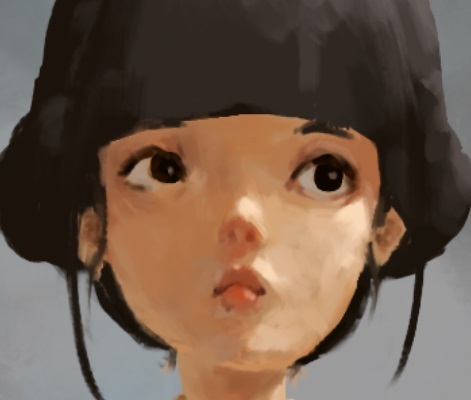
This made me think that it applies to everything. Coloring, lighting, pose, composition, every art basic stuff. For concept arts, this might be about the reason behind the design, every detail of the design, character expression, map design of an environment, etc. This should be your goal everytime you paint something (with some examples when painting an illustration) :

  • I have done putting color in this painting because I know and understand why the color is there in every pixel/inch of the painting.
    • When you should put in warm/cool color.
    • When you should use black in your painting.
    • Why you think it’s good to put in a very saturated “neon” color in your painting.
    • Tips : When doing digital, I don’t depend too much on Layer modes (Overlay, Multiply, Difference, Color Dodge, etc). They’re evil, especially for color and value. I only use them when I know what I’m doing, for example, use Multiply to lower the value on some places with saturated color, use Overlay to highlight the focal point with saturated color, etc. “Color” layer mode is fine because it doesn’t change the value.
  • I have done detailing this painting because I know and understand the distribution of detail in every pixel/inch of the painting.
    • Having realistic detail is good, but having it on every inch of the painting sometimes makes it confusing to the eyes.
    • Focal point should always have the most detail and contrast.
    • But this doesn’t mean everything should look blurry.
    • Things that I usually blur in paintings : very unimportant objects can be blurry, moving objects should be blurry,  darker/shaded area can be blurry (especially when the environment is bright), brightest area can be blurry (especially when the environment is dark).
  • I have settled the lighting in this painting because I know and understand the light source, and how the lighting compliments the composition in the painting.
    • Lighting can be used to direct eyes to the focal point, so we can put a strong spotlight on the focal object. This affects the composition of the painting.
    • The lights casted on the objects will define their shapes and value.
    • Because lighting and value affects the composition of painting so much, I think it’s better to have value and lighting in the composition sketch phase. If you just have value or lighting, or even just lineart for composition sketch, the finished result will be different from what you might wanted to achieve in the beginning.
  • I have finished this painting because I know and understand what I have made in every pixel/inch of the painting.
    • Sums up everything. lol.

This requires a lot of all basic knowledge of art in order to actually finish a painting, if we’re talking about perfection.

Note: I want to make this clear that this isn’t about being a perfectionist. Illustration is meant to ILLUSTRATE your idea, what you’re trying to convey, into a picture. All the points above are only aspects to be used to convey your idea.

I always limit myself whenever the “perfectionist” side of me kicks in. When I feel like I’m tired of trying to polish everything and redo everything to make it perfect, I stop. And then I think again what I was trying to convey in the beginning, and see if what I have made is already enough to illustrate my idea. Usually it’s already enough, but might not be good enough. But it’s actually okay to stop. Because this is illustrating, not a painting study. I make it based on my basic understanding, with some reference. I think the purpose of painting study is to break the knowledge limit, while illustration is to illustrate idea.

However, the biggest problem is every artist has their own finish line, and it’s based on their understanding of the basic. This also defines someone’s “style”. Someone with very good understanding of anatomy but little understanding of color might have a shorter finish line when he’s painting a colored painting of human body, because maybe he only uses flat color and some hatching to define the form. Someone with a better understanding of color might think that it still looks like a WIP, because it doesn’t have the hue variation where veins make the skin look cooler, and areas with more arteries have red hue. This leads to the second part, “Expanding the Finish Line”.

Edit : This doesn’t mean that a simple style illustration is worse than a complicated one. Sometimes simple is better, and it actually boost the readability a lot, compared to a complicated painting with a lot of messy brush strokes everywhere. A flat colored artwork with hatching to define the form is much better than if we add too many hue variations. Too many hue variations might be an eye cancer. It all depends on the purpose of the illustration, and how the artist execute it.


Expanding the Finish Line

I believe the different definition of “finish line” between every artist is the reason why newbies and experienced artists works look very different. Easiest example, I ask you to illustrate two men fighting with each other. Do you imagine them fighting on a horizontal line, one punching the other’s face? Then that’s your solution to the idea of “two men fighting with each other” and that’s your finish line. You will make the sketch, and try to finish the illustration with that picture in mind. But an experienced artist might draw it with 3/4 camera view, one guy evading the kick from the other guy, with some motion blur of the movement, and preparing for a counter attack. There might be some sweat dropping from the movements reflecting the light from above. Or maybe another experienced artist might make a foreshortening key shot of a punch, while the second guy avoided it by moving his head.

The definition of “finished” of a painting is actually already determined ever since the start of painting, when you decide how you’re going to make it. Of course there will be a lot of improvements and revisions when making it, but I’m very sure that it’s still going to refer to the idea sketch that you made in the beginning. If you have more detail of the idea planned at the sketch, the finish line will automatically be longer.

There are two major ways to expand the finish line I’ve found so far. One, observe and study, look at some professional works idea, how detailed THE IDEA is (not the painting), observe how things work in real life. And two, ask for feedback from other artists, especially professional artists, because they will give inputs and insight on how they approach the idea as someone with longer finish line.

finishing
A cropped version of my Tigrex fanart illustration step-by-step.

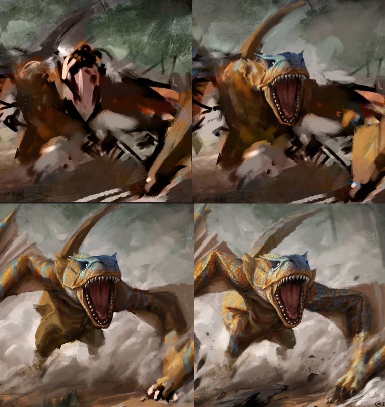
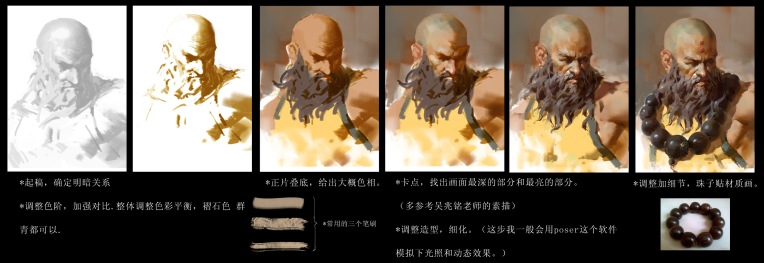
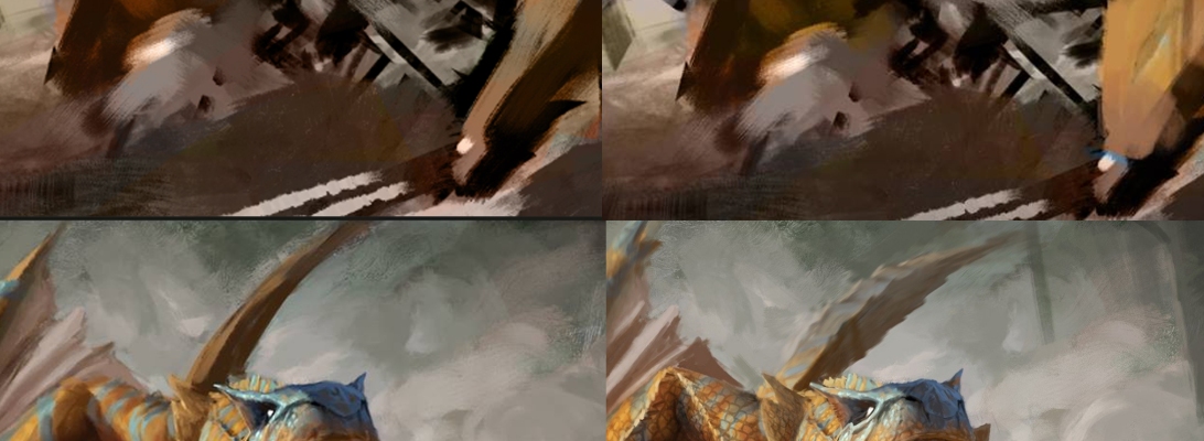
As an example, my “finish line” in the Tigrex fanart is actually “I want to illustrate the feeling of Tigrex going rampage and charging at you recklessly.” So I already limited my finish line that it’s literally only about Tigrex charging, with its mouth open, ready to eat its prey. The smokes are also intentional to make it seem like the dust and sand on the ground are sent flying because of Tigrex’s movement. Also the rocks.

This might not be a finished illustration to more experienced artists who are more used to creating illustrations for professional works, but it has conveyed the idea I had in my mind at the moment. Sure, I should be able to expand the finish line, like adding more objects in the environment, paint actual environment instead of just smoke (lol), draw its prey, or even change the pose into Tigrex jumping and already catching the prey in its mouth. But I don’t even know if adding those things will make it better or not , because it’s still currently beyond my understanding, and I need to study and practice more in order to nail the expanded finish line.

However, I know for sure that I would’ve called it finished at the 3rd step if it was me from 1-2 years ago. Heck, I might have not come up with the composition of Tigrex charging like that (look at my Nargacuga illustration from 2015). This is because I have studied a lot of illustrations and photography compositions these past 2 years.


Conclusion

As a conclusion, I think it’s important to know our own finish line, and we need to always refer to the finish line when we aren’t sure when we should stop doing an artwork. There is also no need to be a perfectionist and try to go beyond the finish line when we’re creating an artwork, because expanding the finish line is when we’re studying and asking for feedback from other artists, and then apply it on the next artwork.

I’m sorry if this tutorial is a bit subjective, but I really hope it helps anyone who read this who is also having trouble in tackling similar problem to mine.

Tutorial: Color

A lot of artists often have these questions in mind like

  • “Which color should I use for this?”
  • “How do I give color to my grayscale value painting?”
  • “Is my color looking a little bit dull?”
  • “Should I use the color black in my painting?”
  • “How do you start with color but still manage to get the correct value?”
  • etc

So, as someone who is very addicted to color and lighting in a painting, I’d like to share my thoughts and understanding of color.

The “RGB, RYB, CMYK” part explains the basic color theories, while the “How I Color” part explains how I apply the color theories in my works.


RGB, RYB, CMYK

Color in digital art consists of three main values that adds up to create one color, Red, Green, and Blue. As all of you might have already known, the maximum value of the three values is 255. The closer the values are to 255, the closer the color that is being produced to white. Having all the three values 0 makes the color black. When the three values equal, they create the color grey. RGB, stands for Red Green Blue, has always been the standard in displaying color on your screen.

However, back in my school, they taught me that the three primary colors are Red, Yellow, and Blue, not Red, Green, and Blue. And then there is this CMYK (Cyan Magenta Yellow Key) color model that is used in printing. So, which one of it should we have in mind when determining color in our painting?

Let us take a closer look at the difference by looking at RGB color wheel and RYB color wheel.

https://i0.wp.com/tutorial9.s3.amazonaws.com/wp-content/uploads/2010/05/3wheels.gif
Link to source : http://www.tutorial9.net/articles/design/simple-practical-color-theory/

So at the picture above, we can see that the most noticable difference is the transition from red, yellow, green, to blue, especially between RYB and RGB. If you look at it carefully, CMY color wheel  is just RGB color wheel flipped upside down, because the main difference does not lie within the color wheel; the main difference is that RGB is an additive color model while CMYK is a subtractive color model (simple, additive means when they add up, they create white color, while subtractive means when they add up, they create black color). But the real problem is, having the primary colors different makes the color relationship different. And you know, this color relationship thing is actually the key to having a good looking painting. So which one should we use as the base to make decision in color choosing while considering the color relationship?

There are a bunch of color relationships we can use in our paintings. Here is a pretty tl;dr picture which explains a lot about color relationships and the meanings.

color wheels - quick reference.jpg
Color Theory Picture. https://paper-leaf.com/blog/2010/01/color-theory-quick-reference-poster/

Now… yeah. You can see that you still gotta use RYB color model in determining colors used in the color relationships because RYB is the actual color model that is used in color theory. RGB is just a color model to display colors on the screen. The reason why we use RGB in computer is just because our screen emits light, which means the colors should add up to create white. This makes the RGB color model perfect for computer screen as it’s an additive color model.

tl;dr, use RYB to determine your color. Oh, and I don’t think I need to explain much about the color relationships as you can just look at the “Color Theory Picture” for it.


How I Color

Alright, now to the main part of this post.

I usually use the HSB (Hue Saturation Brightness) slider in Photoshop to pick my color. It’s pretty convenient to use because I can adjust which color do I want to pick, how saturated it is, and how bright it is. It is also convenient when I want to study an artist’s color usage in his painting, I can observe the hue of the colors he used, how saturated it is, and how bright it is to produce such color in the painting.

When I pick my color, I consider a lot about the atmosphere of the image. I really like to make warm paintings and it can easily be produced by limiting your color range. What I mean by this is, I don’t really want to use a very orange color and very blue color as the main colors in my paintings. Ok, we have that color relationship thing in mind. I usually go for basic complementary or split complementary or double complementary or whatever it is, but the important part is that it’s complementary. However, having the colors complement each other (orange blue, yellow purple, etc) does NOT mean we have to use those exact colors. In fact, using very saturated orange and blue as main colors in a painting makes the painting look so exaggerated in using the complementary color relationship. So how do we tackle this problem? Introducing, the gamut masking.

Here’s a video explaining about it, made by the master of color, James Gurney.

So this gamut masking thing, I think not many artists have known about this. I can conclude this because I’ve seen so many artworks that don’t consider using gamut masking out there. My first ever encounter with gamut masking is when I was studying color for paintings and I found James Gurney’s book “Color and Light”. I was so attracted to the cover (yes, in the end you gotta judge the book by its cover), so I looked up to him and found his blog (gurneyjourney.blogspot.com). And man, holy shit does he have a SHIT TON of useful things in his blog. I found this post explaining about gamut masking in his blog http://gurneyjourney.blogspot.co.id/2011/09/part-1-gamut-masking-method.html. Please do check it out.

So how do I exactly use this gamut masking thing in digital painting?

dvaaaaaa resized.jpg
“I Play to Win!” D.Va fanart by me. Link : https://www.artstation.com/artwork/4RrWk

Simple. I want to make a warm looking painting. So I choose to use red, yellow, orange, and grey as the “blue” to complement my warm colors. Believe it or not, the blue part of the D.Va suit that I painted is actually a less saturated brown. The most blue color in that artwork is the blue part of the suit that got highlighted by the sunlight, and it’s even just a blue with 11% saturation.

ss2016-11-26at01-25-54
The base color for the blue part of D.Va suit
ss2016-11-26at01-24-55
The blue part of D.Va suit that got highlighted

However, I’d still use a very saturated blue in my warm painting to define a blue light. Here’s an example of a good use of saturated blue in warm painting made by Kan Liu https://www.artstation.com/artwork/1XQZo.

Try color picking on that image, and you can find that the only blue there is the one from the blue light. Even the silver colored armor at her shoulder has brown as base color, and green-ish brighter color for the cool light reflection.

ss2016-11-26at04-07-49
Silver shoulder armor base color
ss2016-11-26at04-09-13
Cool light reflection on the silver shoulder armor

What makes the painting look warm is the limitation of “blue” and very heavy usage of brown, orange, and yellow color in that painting.

.

Now, that’s one thing to consider when picking color. So another problem is to have the correct value while applying the color in the painting.

First, I want to make sure that you guys know how to check the value of your painting in Photoshop.

ss2016-11-26at04-18-39
View > Proof Setup > Custom
ss2016-11-26at04-21-49
Set it exactly like this!

So whenever you want to check your value, press CTRL+Y and Photoshop will display the grayscale version of your artwork.

One way to achieve a good value is to start by making the greyscale value painting, and then apply the color on it. There are so many ways to do this, by using the Overlay layer (I don’t really recommend this), Multiply layer, etc. Note that even though you have applied the colors, you still have to paint over the painting with your desired color because most of the time, this method produces very dull color.

My solution to this problem is to use saturated orange/yellow brown color for the “greyscale” painting instead of black. This method is heavily inspired by this Chinese artist, Yu Dehong.

1415880434319.jpg
Source : http://photo.blog.sina.com.cn/list/blogpic.php?pid=bcd1d3b9gddd367822b2a&bid=bcd1d3b90101gvy1&uid=3167867833

I’m sorry I can’t really read Chinese but my guess is he started with grey for the greyscale painting, and then he defines the shape by using yellowish brown to create the shading. He then set the yellowish brown shading layer to Multiply, and paint the base color underneath. Again, this is just a guess, but I’m pretty sure he continued by making a new layer and paint the hue variations, details, and also the reflection on it to finish the painting.

Maybe you want to ask, why orange/yellow brown color? Again, it’s because I want the painting to be warm, so I gotta use orange/yellow brown. One tip from me, the yellowish brown shading layer must be able to define the shape of the object. So it’s also a good way to check if your painting has well defined shape.

Another solution to the value problem is to actually have a good understanding of color values like blue has darker value than yellow, etc. You can start with color if you want to use this method. Even if you haven’t mastered it (like I do hahahah), you can check your value with CTRL+Y and check the value by yourself. I personally use this method for simple doodle works.

.

Now, once I am able to determine the base color and value, I push the value more by using  BLACK. Many artists don’t want to use black in their paintings but I think it’s a waste to not use black in a painting (or at least 1-10 Brightness colors in the HSB slider). Black is such a good color to define value and shadow. It’s also the color we use for ambient occlusion, right? By using black, the painting looks more “bold” and realistic to me because of the well defined value and shadow. The actual reason why people avoid using black is because it’s the darkest color. Using black in your painting means you limit the darkest value there. But I personally don’t think of this as a problem. Instead, it’s a very interesting way to define a focal point in a painting. Some awesome artists I know that use black very well are Ruanjia, Piotr Jabłoński, and Chinese digital artists in general (lmao). Their value control is godly and is always one of the most attractive part of their paintings. Not using black is ok, but sometimes it makes the painting look boring and flat.

There are also several tips that I found while observing their works. When using black, it’s usually better to make the transition from the color to black with a 50% saturated color. For example, you can use red, yellow, or green  to blend the black with your color. Piotr Jabłoński’s work for Dishonored 2 is a great example of this. You can see it here https://www.artstation.com/artwork/1B283. You can find Piotr uses red/yellow brown a lot for the transition to black in his works.

There is also one important thing that you can find in that Dishonored 2 painting by Piotr, it’s the hue variation. Hue variation is the next step in coloring my work after I have found my base color along with the value. I can always adjust the HSB slider a bit to give hue, saturation, and brightness variations. The grey cloud in that Dishonored 2 painting is not exactly grey, some part are more brown, some part are yellowish, some part are a bit green, some part looks like a bit blue (even though it’s just less saturated brown), and this makes the painting looks more attractive.

ss2016-11-26at01-34-04
Hue variation on the skin color rendering by me.

Now take a look at this face of a girl painted by me. It’s from a work that is currently in progress. If you colorpick through the whole face, you can find that the hue, saturation, and brightness are different even though they are probably just that area of the skin that doesn’t get highlighted by the sunlight. Remember that human face has its own hue region (yellow forehead, red nose and cheeks, blue jaw). That’s one this to consider. And then there’s also ambient occlusion for depth defining. I usually use more saturated and less bright skin color to define depth for face. This is actually one of the problems I’ve seen on some head paintings. Some artists don’t do hue variations and define depth, making the face look so flat and not that interesting. Don’t get fixated with one color as the base, give subtle change to the hue/saturation in order to make it look more interesting.

Conclusion

So what I do to make the color in my paintings look better is to apply gamut masking, saturated greyscale Multiply layer, use the color black, and also give hue variation to the painting. It is very important to carefully think when picking the color because it can make the thumbnail of your painting look more attractive.

Note that I’m still a beginner in making this kind of post, so feel free to give me feedbacks. I’m also a self taught artist and I need your opinion about my understanding of color, because the ideal color rendering that I have in my mind is subjective; some people may not like what I think of as the ideal.